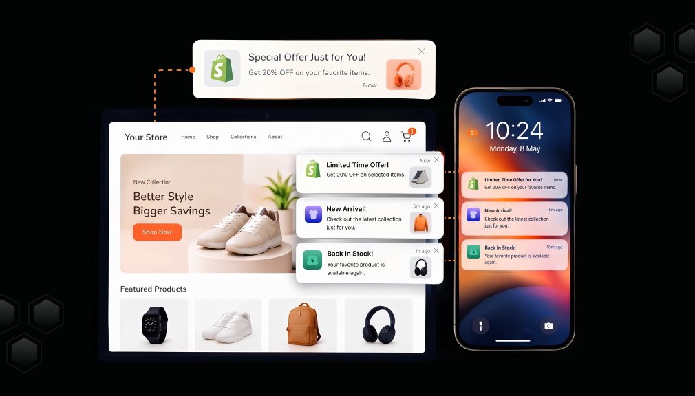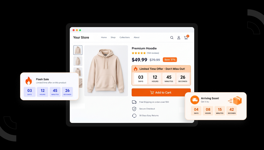






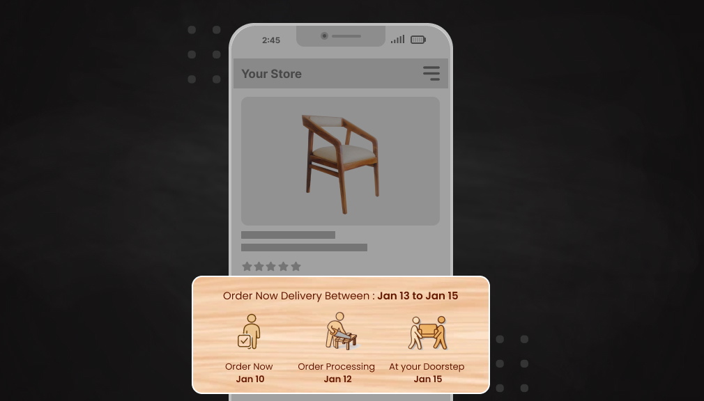
A shopper lands on your product page and starts judging in an instant. Before she reads a word, her mind has formed an impression. Her eyes skim past the price, the photos, and the fine print. A static “ships in 3–5 days” line barely registers at all. Then a small delivery date gently animates into view, and she pauses.
That tiny motion changes everything in a single quiet moment. Her eye follows it and reads “Arrives by August 12.” Something in her relaxes, and the doubt begins to fade. That is the quiet power of an Animated ETA on a page. This post explores why such a small change earns such big trust.
Key Takeaways
- An Animated ETA is a moving delivery date on the product page.
- Shoppers judge trust in about 50 milliseconds, before reading.
- Motion beats banner blindness and draws eyes to the date.
- A specific date builds more trust than a vague range.
- Clear dates lift conversion and cut “Where is my order?” tickets.
- Keep the animation subtle, fast, and friendly to reduced-motion users.
- An app adds an Animated ETA without fragile custom code.
What Is an Animated ETA?
An Animated ETA is a moving delivery date shown on your product page. It combines a specific arrival date with subtle, eye-catching motion. Instead of plain text, the date gently slides, fades, or pulses into view. That small movement draws the eye to the exact info shoppers want. It turns a forgettable line into a clear, confident promise.
The idea is simple, but the effect runs surprisingly deep. “ETA” means estimated time of arrival, the day an order should land. The animation makes that date impossible to miss on a busy page. The specific date makes the promise feel real and believable. Together, motion and specificity build trust in a single glance.
Why a Tiny Change Moves the Trust Needle
Trust online is decided far faster than most merchants imagine. According to design research, visitors judge a page in about 50 milliseconds. That is faster than a blink, and it happens before reading. In that instant, 94% of the first impression comes from design. A well-placed Animated ETA speaks to that fast, visual judgment.
Our eyes are wired to notice movement above almost everything else. Static text often gets skipped, a habit known as banner blindness. A gentle animation quietly breaks through that habit without shouting. It guides attention to the delivery date at just the right time. That is why an Animated ETA gets noticed when plain text does not.
Specificity is the second half of this simple trust equation. “Arrives August 12” feels honest, while “3–5 days” feels vague. A real date signals that you know your own shipping process well. Vague ranges force shoppers to guess and quietly raise doubt. An Animated ETA pairs a clear date with attention-grabbing motion.
Certainty is what calms the anxious moment right before buying. Every purchase carries a small fear of the unknown outcome. “When will it arrive?” is often the loudest unspoken question. An Animated ETA answers that question clearly and very early. That answer replaces hesitation with the confidence to click buy.
The Psychology of Motion and Trust
To see why motion works, look at how the brain processes visuals. The mind reads an image far faster than a block of text. Movement reaches that fast, instinctive part of our attention. So a moving date lands before the shopper even starts reading. It meets the brain where snap judgments are actually made.
There is a halo effect quietly at play here as well. A store that sweats small details feels more reliable overall. A polished Animated ETA hints the whole store is trustworthy. One careful touch quietly lifts confidence in everything around it. Small signals like this shape how shoppers judge your brand.
The Data Behind the Feeling
The feeling of trust shows up clearly in hard numbers too. According to research from the Baymard Institute, cart abandonment rates are near 70%. Slow or unclear delivery ranks among the top reasons buyers leave. A visible, believable date removes one big reason for that exit. The Animated ETA makes that date impossible to overlook.
Shoppers reward stores that show honest, specific delivery dates. Narvar’s 2025 shopper survey found 73% let a visible date guide their purchase. Even more striking, 40% will not buy without a clear date shown. Real-world Shopify tests report conversion gains of roughly 12–25%. An Animated ETA helps capture that lift by making the date shine.
There is a quieter benefit after the sale is complete, too. A clear date on the page reduces “Where is my order?” tickets. Shoppers who saw a firm date feel calmer while they wait. Fewer worried emails free your team for more valuable work. So the Animated ETA protects both revenue and support time.
The cost of a vague date is easy to underestimate too. A fuzzy range quietly plants doubt at the worst moment. That doubt often turns into a silent, unexplained exit. You rarely see these lost sales, but they add up fast. A clear Animated ETA closes that gap before it opens.
Where the Animated ETA Earns Its Keep
The product page is where this small change matters the most. It is the moment a shopper decides to trust you or leave. An Animated ETA sits right there, answering the key question early. It removes doubt before the add-to-cart button is even clicked. That timing is why such a small feature carries such weight.
The same idea helps on the cart and checkout pages too. A moving date there reassures shoppers at the final, nervous step. It keeps the promise consistent across the whole buying journey. Each touchpoint reminds the shopper that their order will arrive. Consistency like this quietly deepens trust at every stage.
The same idea helps on the cart and checkout pages too. A moving date there reassures shoppers at the final, nervous step. It keeps the promise consistent across the whole buying journey. Each touchpoint reminds the shopper that their order will arrive. Consistency like this quietly deepens trust at every stage.
Mobile makes this small feature matter even more today. Most shoppers now browse and buy on small phone screens. On mobile, a static date is even easier to scroll past. A gentle animation gives it a fighting chance to be seen. That extra attention matters most where thumbs move fast.
Pair the Animated ETA With Other Trust Signals
An Animated ETA works even better beside other trust signals. Shoppers weigh many small cues before they decide to buy. A moving date pairs naturally with reviews and stock status. Together, these cues form one clear, reassuring picture. Each signal makes the others feel more believable and strong.
Think of trust as a quiet stack of small proofs. Star ratings show that others were happy with their order. Stock status shows the item is real and ready to ship. The Animated ETA shows exactly when it will arrive. Stacked together, these cues turn doubt into confident action.
A Real Example: Two Identical Pages
Picture two product pages selling the very same jacket today. They share the same price, the same photos, and the same reviews. One page shows a plain “ships in 3–5 days” line of text. The other shows an Animated ETA reading “Arrives by August 12.” Most shoppers will trust and buy from the second page.
The difference is not the words alone, but the attention they earn. The static line blends in and quietly disappears from view. The animated date catches the eye and feels like a promise. That small shift in attention becomes a real shift in sales. One tiny change quietly tips the decision in your favor.
How the Estimated Delivery Date App Puts This to Work
This is the exact mechanism behind our Estimated Delivery Date – ETA app built around the idea that an ETA should be a moving, active part of the page, not a static footnote.
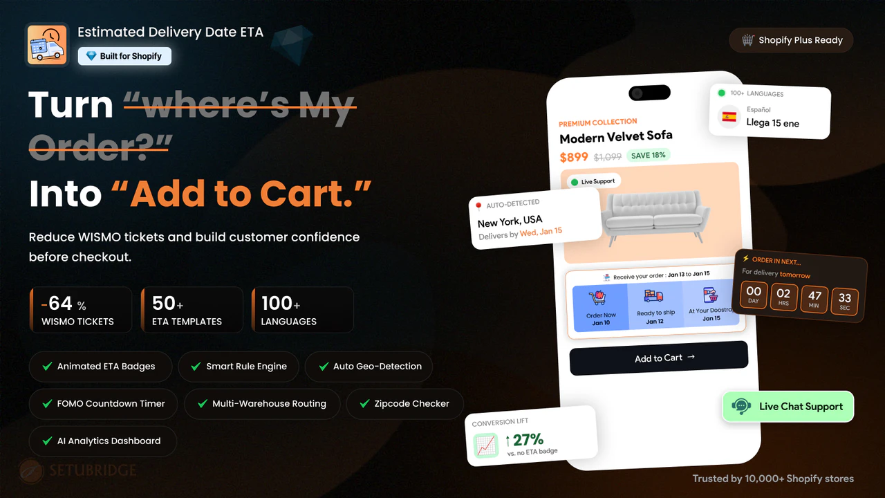
Animated ETA templates replace a plain shipping line with a countdown-driven display that visibly holds attention instead of blending into the layout.
Real cutoff-time logic powers the countdown, so “order in the next 2h 15m” reflects an actual dispatch deadline; the urgency shown is always real, never manufactured.
Location and shipping-method awareness means the estimate shown is calculated per shopper, not a single generic promise applied to everyone.
Consistent display from the product page through checkout and confirmation email keeps the trust signal present at every stage a shopper might hesitate.
A recurring pattern in merchant reviews is that showing accurate, country-specific delivery windows contributed directly to more completed purchases. Features like Animated ETA: A Small Product Page Change That Builds Customer Trust make delivery estimates more visible and engaging, helping shoppers feel confident about their purchase. As a result, clearer ETAs also reduced “Where Is My Order?” support requests, reinforcing a simple truth: when customers trust delivery information, they buy with more confidence and need less reassurance after checkout.
The Guardrail That Makes This Work Long-Term
An animated ETA only compounds trust if what it’s counting down to is real.
The cutoff has to be genuine. If “order in 2 hours for same-day dispatch” isn’t actually operationally true, the first customer who orders at 1h 58m and doesn’t get same-day shipping will remember it, and every future countdown you show them will carry less weight.
It shouldn’t be the only thing moving on the page.
A countdown works because it stands out. Stack it next to an animated stock counter, a pulsing “hot deal” badge, and a scrolling announcement bar, and none of them stand out anymore; you’ve rebuilt the exact static-noise problem this is meant to solve, just with more motion.
Specificity has to stay accurate, not just impressive. “3h 42m” only builds trust if it’s calculated from real processing and shipping data. A precise-looking number that isn’t backed by a real deadline is a promise waiting to be broken.
The Actual Takeaway
The product page moment that convinces a hesitant shopper isn’t usually the biggest, boldest element on the page; it’s the one that answers the question they’re actually holding onto: will this get here in time? A countdown built on a real cutoff answers that question in a way a static sentence can’t, and it does it at the exact moment the shopper is still deciding.
That’s not a minor formatting choice. It’s a small, honest piece of information given a format that actually gets read.
Frequently Asked Questions
Do I need custom coding to add this to my Shopify product page?
No, the Estimated Delivery Date App uses ready-made animated templates that turn on through the app settings. Store owners can adjust the look and copy without editing theme files.
What happens to the countdown during high-volume periods like BFCM when cutoff times shift?
The countdown updates automatically because it’s tied to real cutoff logic rather than typed-in text. When fulfillment rules change for a sale period, the display changes with them, so no one has to manually rewrite the copy.
Should I run the countdown alongside other urgency elements like stock counters?
It’s best to let the countdown be the main moving element on the page rather than one of several. Stacking it with stock counters, flashing badges, or scrolling banners makes all of them easier to tune out, which cancels the effect.
Can an inaccurate countdown increase support tickets instead of reducing them?
Yes, if the promised cutoff isn’t operationally real, shoppers who order near the deadline and miss it will file more “where is my order” tickets, not fewer. Accuracy is what lets an animated ETA cut support volume instead of adding to it.

Shopify Expert
Dipen Panchal, Shopify Tech Lead at Setubridge Technolabs, brings over a decade of expertise as a Shopify Expert. Passionate about e-commerce growth, he specializes in UI/UX design, crafting intuitive, engaging solutions tailored for merchants and B2B clients to enhance user experiences.